The Biggest AS Doesn't Exist
Two ways to rank a BGP table, both reasonable, sharing zero members in the top twelve
Michel Wijnberg
Every view of a BGP table eventually needs a list. There are 79,168 ASes in the one I measured and a screen holds perhaps a dozen, so something has to decide which dozen.
That control looks trivial. It is the most consequential thing in the whole view, because the ranking you choose does not just reorder the answer. It changes which networks the operator believes matter, and two defensible choices produce lists with nothing in common.
The obvious axis, and why it fails
Rank by how many prefixes each AS originates. Biggest first. It is what almost
everything does, it is one GROUP BY, and it is wrong in two separate ways.
It does not converge.
| Ranked by origin prefix count | Coverage of the table |
|---|---|
| Top 12 | 8.3% |
| Top 1,000 | 52.9% |
A thousand networks to account for half the table. That is not a ranking, it is the table again with the rows in a different order. There is no dozen at the front of this axis that explains anything, because the distribution has no head to speak of.
And it pays for deaggregation.
Prefix count measures announcements, not address space, and those are only loosely related. One number says it: divide each network’s announced prefixes by the number of contiguous address blocks they actually cover, and table-wide this feed averages 1.64 prefixes per block. The top twelve average 3.4. The most extreme case measured, AS18403, announces 4,611 prefixes across 26 blocks, a factor of 177. AS9808 runs at 86 times, AS4538 at 66.
So the leaderboard rewards whoever chops their space finest. A network that announces one clean /16 sinks below a network announcing the same /16 as 256 /24s, and the second one is arguably the worse internet citizen. Sorting by prefix count is sorting by volume of speech.
Rank the same table by unique address space instead (3,121,065,344 addresses in total) and the list does not shuffle. It comes apart:
| AS | Rank on prefixes | Rank on address space |
|---|---|---|
| AS16509 | 1 | 2 |
| AS9808 | 2 | 12 |
| AS8151 | 3 | 32 |
| AS12479 | 4 | 71 |
| AS7545 | 5 | 141 |
| AS39891 | 8 | 308 |
Number eight by announcements is number 308 by address space. Meanwhile the network that is actually first on space, AS749, holds 7.17% of that total from 3,133 prefixes, and AS4134 comes third on 729. Those are networks announcing large blocks whole, which is what you would hope for, and prefix count buries them.
One trap on the way, because getting it wrong is easy and silent: this has to be a union, never a sum. Adding up 2^(32 − masklen) across overlapping prefixes double-counts every covering aggregate, measured at 1.269× table-wide, and that is more than enough to change the order. The prefixes have to be merged into non-overlapping ranges before anything is ranked or drawn. We shipped the summing version first. It did not crash, the totals looked reasonable, and the ordering it produced was plausible enough that nobody questioned it until a review went looking. That is the failure mode worth fearing in a measurement: not a wrong answer that announces itself, but a credible one.
The axis that does converge
Ask a different question. Not “who announces the most” but “whose disappearance would cost me the most reachability”. Greedily: pick the AS that reaches the most origin ASes, drop those origins from the pool, and repeat against what is left. Our own directly connected upstreams are excluded, because otherwise the first picks are dominated by the vantage itself rather than by anything about the table.
| Step | AS | Cumulative share of origin ASes reached |
|---|---|---|
| 1 | AS2516 | 38% |
| 2 | AS7575 | 60% |
| 3 | AS2497 | 82% |
| 4 | AS6939 | 90% |
| 5 | AS1221 | 94% |
Five networks reach 94% of the origin ASes visible from this vantage. The same table needed a thousand to reach 53% on the other axis.
That is the answer an architect wants: these five are the transit substrate this vantage is resting on, and losing one of them is a different class of event from losing the network with the most prefixes.
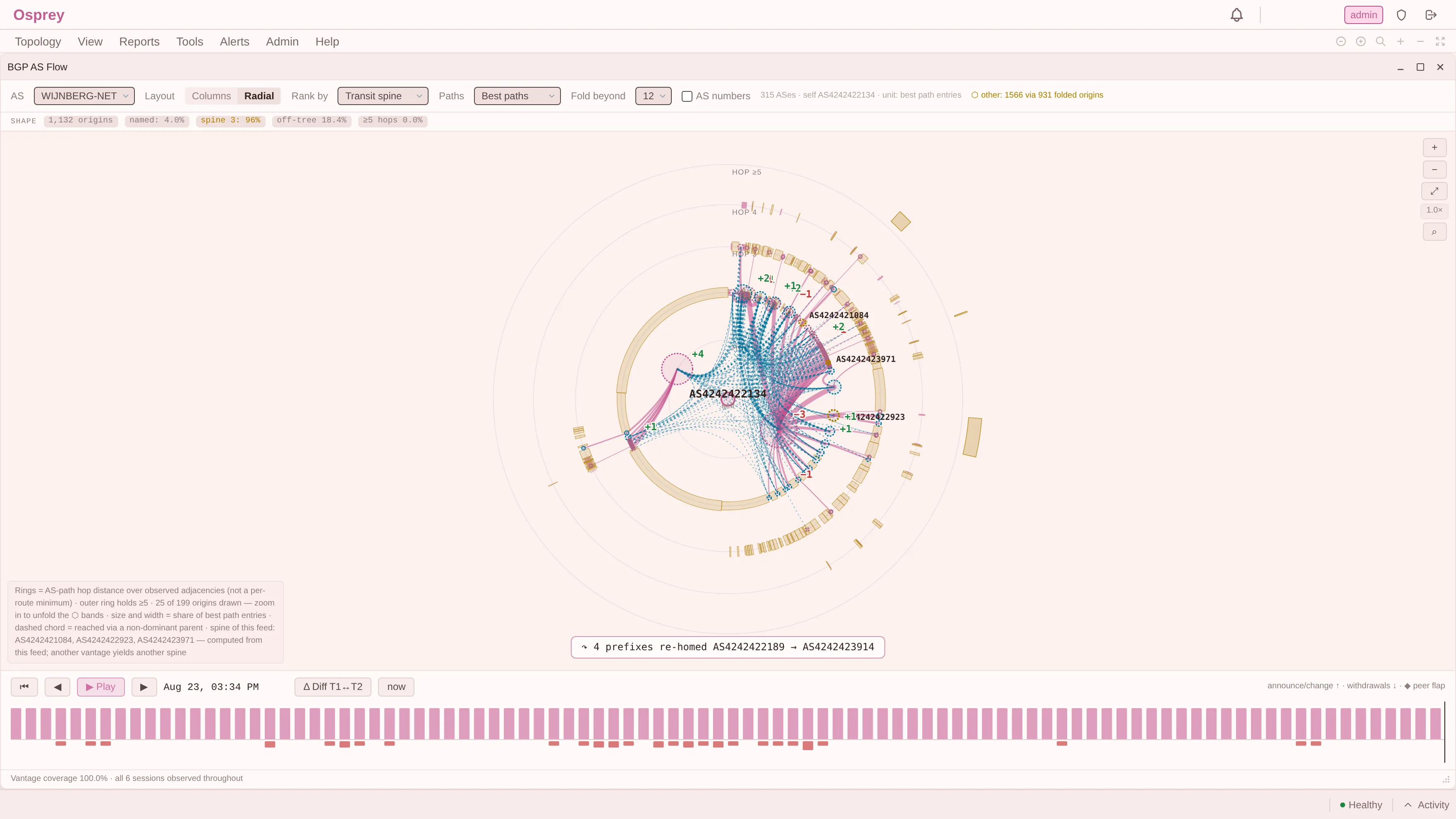
The picture above is the same control on a different and much smaller feed, where the answer is three networks at 96% rather than five at 94%. The number of entries is not the point and does not transfer. What transfers is that this axis has a head at all, and that the strip states its coverage next to it instead of leaving you to wonder whether the rows on the screen are most of the story or a hundredth of it.
It needs one caveat, and it is the one the previous post earned. Reach is computed as a cone over the dominant tree: each AS is attributed to its heaviest predecessor, and the subtree below it is summed. That is a tree projection of a graph I have just spent an article proving is not a tree, and the error is not hypothetical, it is the 17.5% of edge mass that does not arrive via the heaviest parent. So the number is a tree-sum over a non-tree, which is why the product labels it as one rather than presenting it as reachability. It is good enough to rank with and not good enough to quote as a dependency guarantee.
Two things convinced me the number was sound rather than lucky. A 1:10 sample of the same collector, every tenth origin carried across with all of its prefixes, paths and predecessors (11,136 ASes, 7,854 origins, 106,900 prefixes), reproduces the identical five ASes in the same order at 34/62/76/86/88%. The mechanism is not mysterious either, and it is the whole difference between the two axes. Prefix count asks what each network owns on its own: every prefix belongs to one origin, nothing is shared, so the ranking is a long tail of independent contributions. Transit reach asks what depends on each network, and dependency overlaps heavily. Each pick absorbs most of what the next one could have claimed, which is why five entries exhaust the question and a thousand prefix-count entries do not.
The part that made me rewrite the control
Here is the finding I did not expect. The two top-twelve lists, from the same table, in the same hour, share zero members.
Not “mostly different”. No overlap at all.
That is not a tie-break problem, and it is not something a good default resolves. It means the control is not a sort order. It is a question selector, and the two questions are:
- Who announces the most prefixes? Answer: the networks in the deaggregation table above.
- What is this table resting on? Answer: a completely different set, none of which appears in the first.
Both answers are correct. Neither is “the biggest AS”. The phrase does not refer to anything, which is why a view that offers a single ranking and calls it importance is making a claim it cannot support.
So the control in Osprey is two explicitly labelled axes rather than one sort direction, and the threshold beside it says which role it is playing: fold beyond N is a layout operation, name top N is a labelling operation, and they are two different things done to the same number. Getting that wrong was one of the review findings against our own build.
What this costs the reader
A ranking that does not converge has a specific failure mode in an operations context, and it is worth naming because it is not obvious.
If the top twelve cover 8.3%, then the twelve rows on the screen are unrepresentative of the other 91.7% in a way the screen does not signal. An operator who reasons from them is reasoning from a sample that was selected by a property nobody chose deliberately. It looks like the important networks. It is the ones that announce in the smallest pieces.
The transit-reach axis has the opposite property. Five rows covering 94% means the screen is showing you nearly all of the structure, and the ones you cannot see are genuinely marginal. That is the difference between a list and an explanation.
The limit
Transit reach is computed from your table, so it inherits every property of your vantage. It is not a measurement of the internet’s structure. It is a measurement of what your feed can see of it, and the next post is about how far apart those two things are.
It also depends on what your upstreams chose to send you. A path that was filtered before it reached you does not appear in the ranking, and no amount of computation recovers it. The reach numbers are therefore a lower bound on dependency: everything listed is real, and there may be structure behind the filter that is not.
Saying that is cheap, and it is the difference between a number you can plan with and a number that will embarrass you.
The point
The control that decides which twelve rows an operator sees is not a presentation detail. On this table it decides between two disjoint answers, both defensible, one of which converges and one of which does not.
“The biggest AS” sounds like it names a fact. It names whichever question the default sort happened to encode, and most tools never tell you which one that was.
Which is the design rule this post is really about: a control that decides what an operator looks at has to expose the question it answers. “Sort by: importance” is not a convenience. It is a model choice, made by whoever wrote the dropdown, on behalf of somebody who will never be told it happened.
Next: those five transit networks are Asia-Pacific, and that is not a fact about the internet. Your Backbone Is Not the Internet’s.