Your Backbone Is Not the Internet's
Five networks reach 94% of the origins in my table. Move one AS_PATH hop and it is five different networks.
Michel Wijnberg
The previous post ended with a result that looks like a fact about the internet: five autonomous systems reach 94% of the origin ASes in a million-path table. Here they are.
AS2516. AS7575. AS2497. AS6939. AS1221.
Now the part that matters. Those are Asia-Pacific networks, and their dominance here is a property of this vantage and the two upstreams feeding it, not a measurement of a global backbone. I am deliberately not claiming the collector’s geography caused it: what the table shows is which networks these particular upstreams put on these particular paths, and upstream selection, policy and commercial relationships are all tangled into that. In the same measurement, Lumen appears at 11% and Cogent at 6%, two networks most engineers would name without hesitation if asked to list the internet’s backbone.
Move the feed one AS_PATH hop and the answer is five different names.
This post is about that, because it is not a curiosity. It is the property that decides whether a tool is telling you something about the internet or something about your own connectivity, and almost nothing labels which.
What the ranking is actually measuring
“Transit reach” sounds like a global property. It is computed as: of the origin ASes in my table, how many sit in this AS’s cone. Every term in that sentence is scoped to the feed, and the cone is taken over the dominant tree, which the previous post showed is an approximation of the real graph rather than a description of it.
So the honest reading of the five names above is not “these are the internet’s core”. It is:
Given where this router sits and what its two upstreams chose to send it, these five networks are what its reachability rests on.
That is a genuinely useful answer. It is the one you want before deciding which transit contract to renegotiate. It is just not transferable to anyone else, and a product that presented it as though it were would be shipping its author’s geography as a feature.
Which is why there is no list of tier-1 networks anywhere in Osprey’s code, and why there is not going to be one. The ranking is computed per feed, from your table, every time. A hardcoded list would be right for whoever wrote it and quietly wrong for everybody else, and the failure would be invisible: the names would look plausible.
The same table, a third question, a fourth answer
Series so far: rank by prefix count and you get deaggregators. Rank by transit reach and you get the five above. Here is a third axis, which we built because “who should I peer with” is a different question again.
Rank the address space that reaches you through transit, by origin, at hop two or more:
AS1136 (KPN). AS6805 (Telefónica Germany). AS9644 (SK Telecom). AS3243 (MEO). AS4739 (iiNet).
Access networks. Not one of them appears on either previous list. These are the networks whose eyeballs are currently arriving via somebody you pay, which is exactly the set a peering coordinator wants.
And this axis is far steeper than prefix count, which is what makes it usable. Both columns below are measured over the same population, the origins reached via transit, so they are directly comparable to each other. (They are not comparable to the 8.3% in the previous post: that one was top-12 by prefix count over the whole table, a different denominator.)
| Coverage of the via-transit population | By address space | By prefix count |
|---|---|---|
| Top 12 | 42.2% | 10.9% |
| Top 48 | 63.5% | 27.9% |
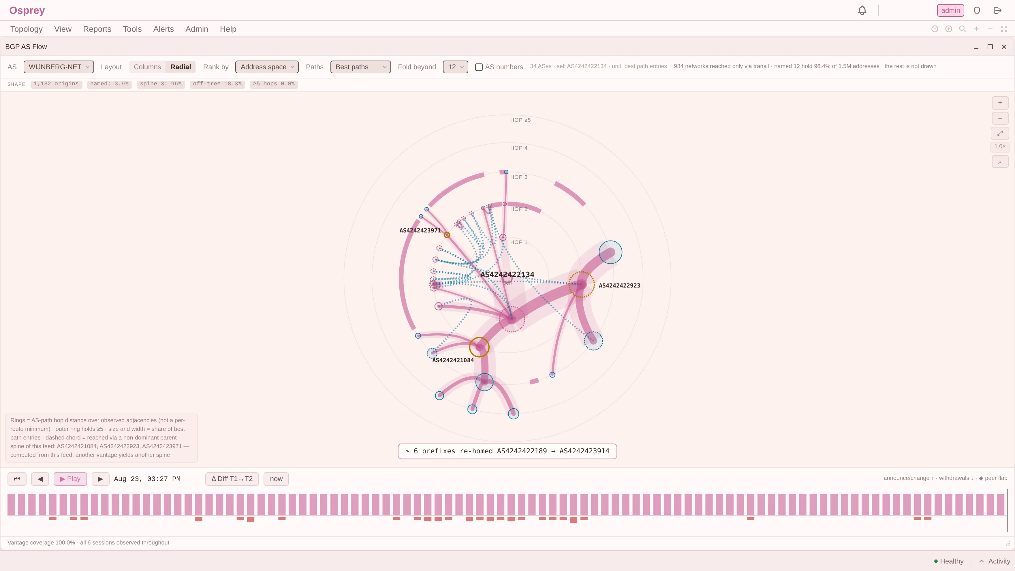
That is the axis running on a different feed, DN42 rather than the full table, so the names and the percentages are its own. What carries across is the header line: it says how many networks the axis is about, how much of the space the drawn ones hold, and that the remainder is not on the screen. A view that dropped that last clause would look identical and mean something else.
Three axes, three disjoint answers, one table. None of them is the ranking. Each is an answer to a question somebody actually has, and the only dishonest move available is to offer one of them unlabelled.
Two places our own implementation assumed a shape that was not there
Both of these are worth writing down because they are the same error in different clothes: computing a global property from a local structure.
Summing a subtree is not a union. The first design computed transit space client-side, by adding up the address space of everything below a node. That is wrong by a factor of 1.3 to 3.6 against the real union, because an origin’s address space does not all arrive through one transit. Space that reaches you two ways gets counted twice, and the error is not a constant you can calibrate out; it depends on how multihomed the customers happen to be. The field is now computed server-side as a genuine union over the prefixes that pass through the AS, or it is not served at all.
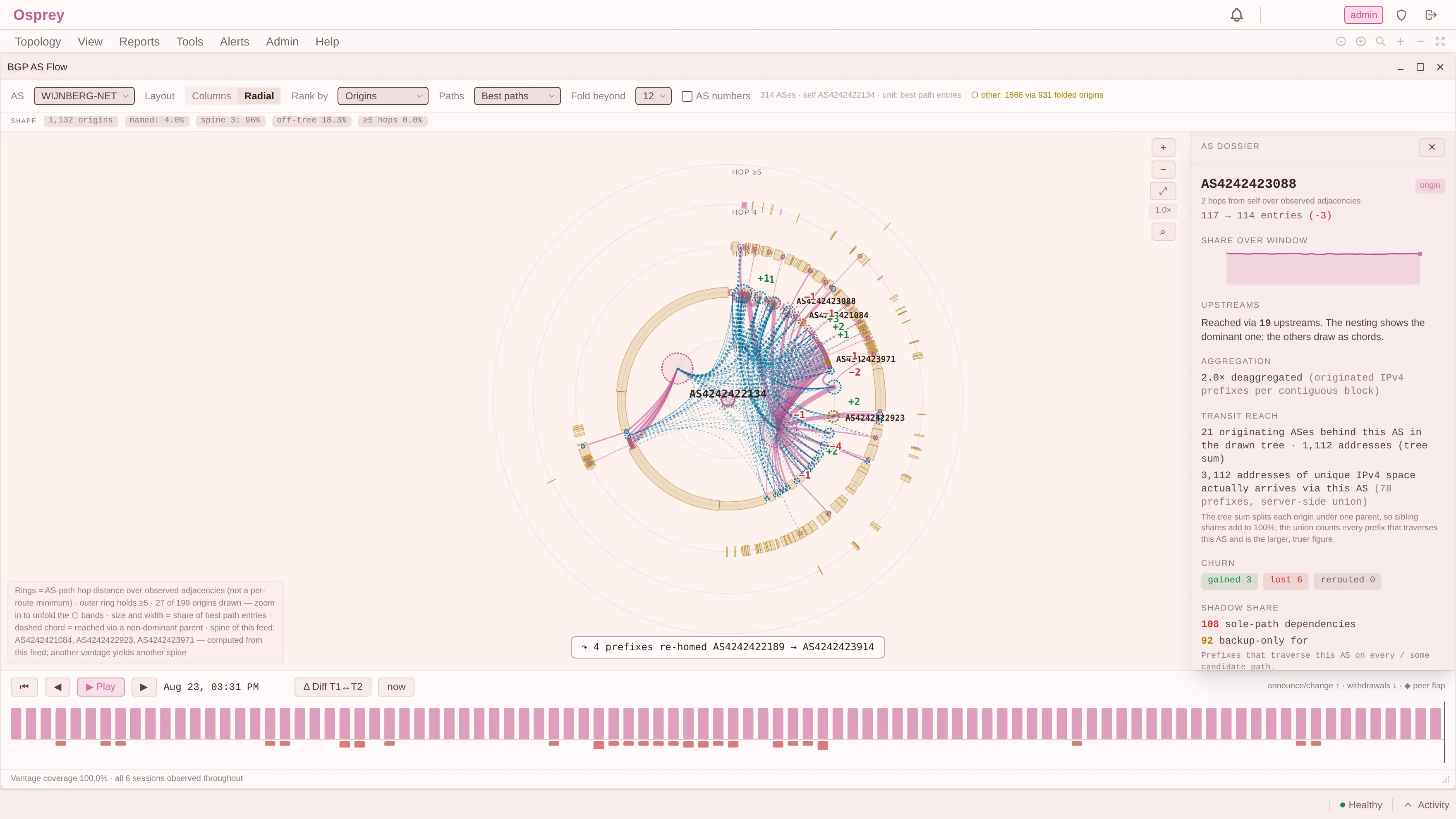
The fix is visible in the product rather than hidden behind it. Both numbers are shown, the smaller one is labelled a tree sum, and the note underneath says which is the honest answer and why. That is more words than a single figure would need, and it is the difference between a number and a number you can act on.
A candidate is not necessarily a leaf. The first implementation of the third axis took only leaf nodes, on the reasoning that origins sit at the edge. It skipped 276 ASes carrying 37% of all originated prefixes. AS9808 originates 14,214 prefixes and has five customers underneath it. That is the previous post’s 94.4% figure showing up as a bug rather than a statistic: if almost every transit also originates, then “origins are the leaves” is not a simplification, it is a filter that discards a third of your answer.
Both were caught by measuring against a real table. Neither would have been caught by DN42, where the structure is small enough that the approximations happen to hold.
The filter that does nothing here and would work for you
One more vantage artefact, and this one is almost funny.
The third axis has a hop filter: show origins at distance two or more, so you exclude your direct neighbours. On this feed it removes 3 of 7,578 origins. It does essentially nothing, because the vantage is a stub with two upstreams and therefore has almost no direct neighbours to exclude.
On a network with real peering, the same control is significant. Same code, same default, and its usefulness swings from decisive to inert depending on where it runs.
We kept it, because the value of the axis is in the space measurement rather than the filter, and because the alternative is tuning a control against one vantage. But it is a good illustration of how far the “this is what a network looks like” instinct can be from any given network.
The absence is vantage-shaped too
Post 13 argued that what is missing from your table is not far away, it is absent, and that absence has no radius. The vantage angle finishes that thought.
Each of the four reasons a path is missing is a property of your position. Something was not advertised to you. Your policy refused it. An aggregator upstream of your feed collapsed it. A route server you are behind left no hop. Point the same code at a different table and a different set of things becomes invisible, silently and without any of them being marked.
So the gaps are not noise you could average out with more feeds from the same place. They are structured by where you sit, which is the strongest form of the argument this post has been making: your vantage does not merely rank the internet differently, it decides which parts of it exist for you at all.
The point
Everything in this post is a number computed correctly from a real table, and not one of them is a fact about the internet.
The five networks your table rests on, the ranking that converges, whether a filter does anything, even whether “origins are leaves” is a safe simplification: all of them moved when the vantage moved, and two of them moved far enough to be bugs.
An operator asking “what does the internet look like from here” is asking the right question. The word doing the work is here, and a view that drops it is not being simpler. It is answering a question nobody asked, using somebody else’s connectivity.
Next: what it costs to keep a full feed, measured rather than estimated, including the default of our own that the measurement killed. What a Full Feed Actually Costs.